MyHumber

1 month

UX Design


About Project
The MyHumber website, although the most important platform for Humber Polytechnic students, still violated key usability heuristics and visual design principles. Therefore, our team embarked on its redesign. On this page, students find out their schedule, upload personal documents, make academic payments, apply for scholarships and much more, so this platform is the first-wall value of the polytechnic.
Defining & Ideation
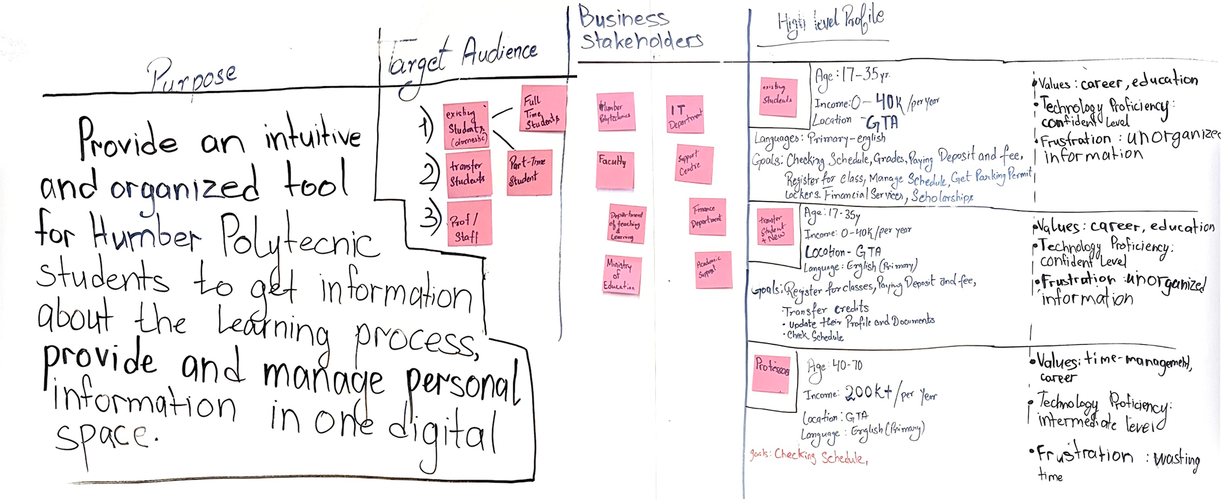
The process began with defining and ideating to build an understanding of who, why and why they use the platform. In this project, because of the tight deadline, we did not create a team brief, but presented all the information to the client in a condensed form.
Sketches
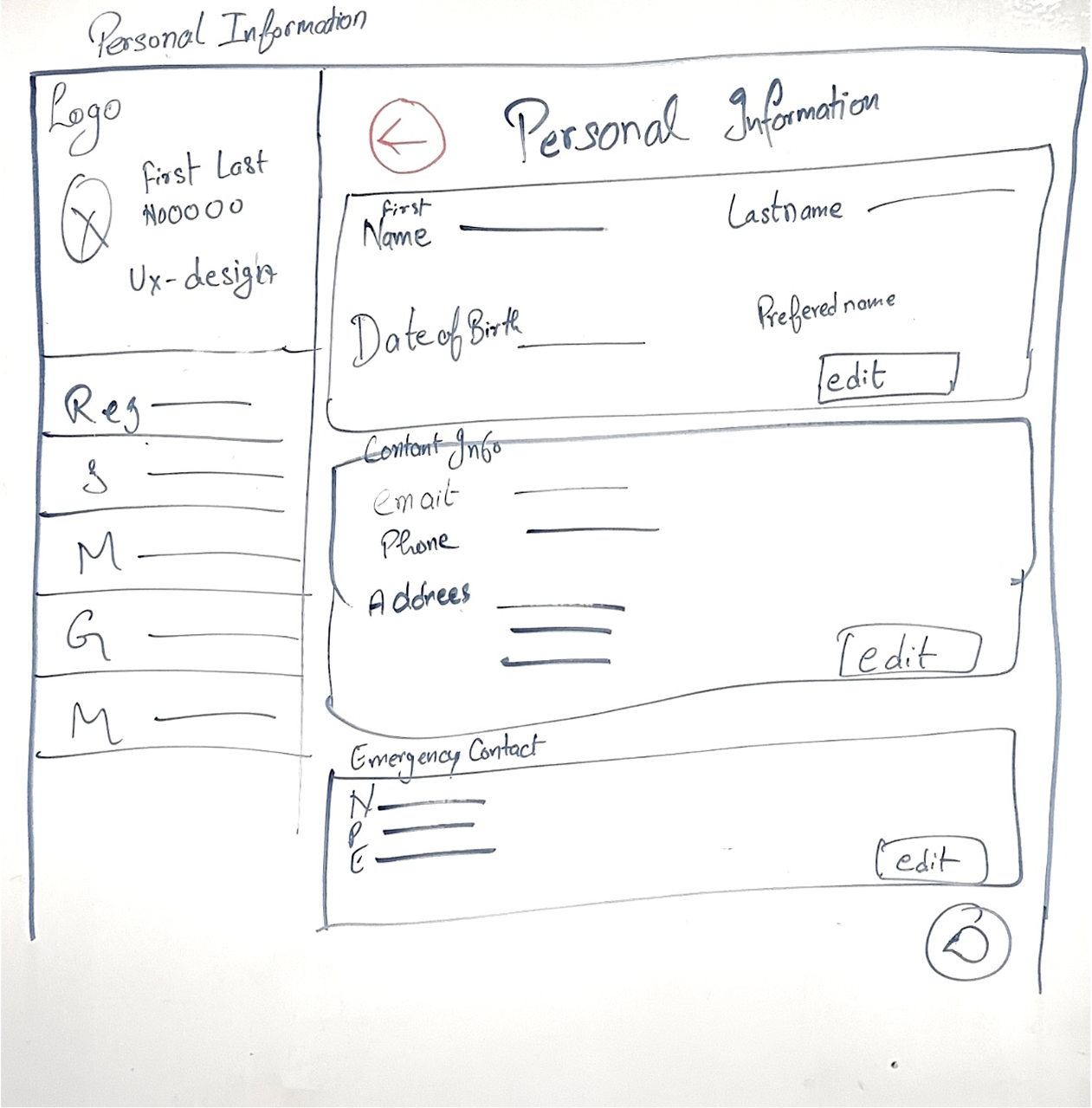
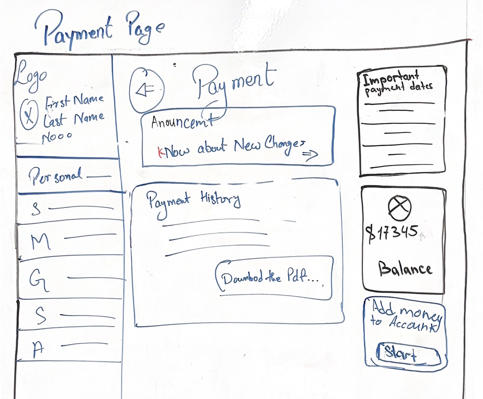
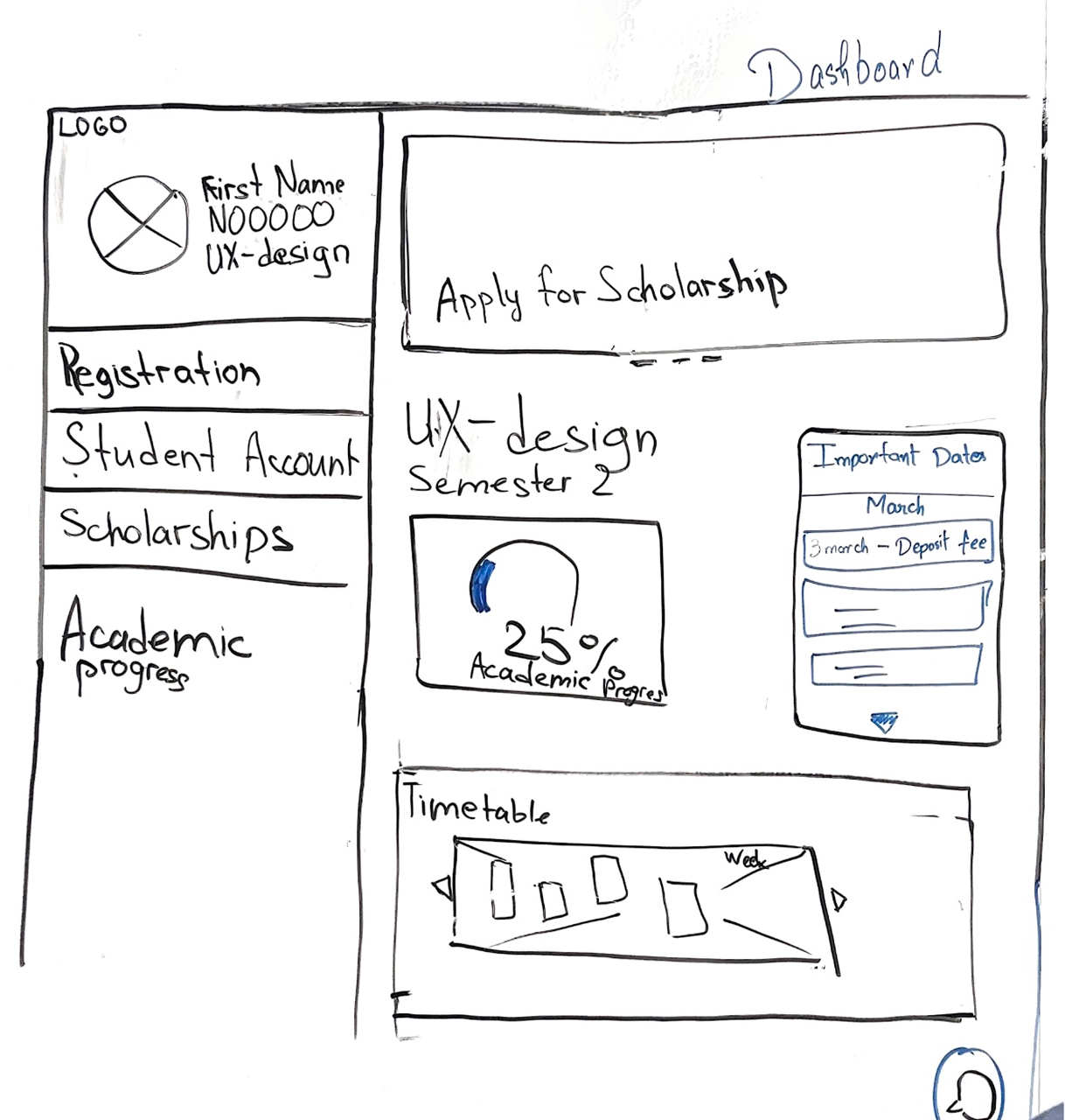
The next phase was sketching, we designed 4 basic screens for the MyHumber platform. The main style of our design is block elements. We developed a new navigation system, added some new sections and blocks that we thought were important and useful for the target audience after their research. We stopped at 4 screens to make the process iterative and the customer could choose whether to keep the design or not. Since the MyHumber platform is huge and contains a large number of pages.
Mockups
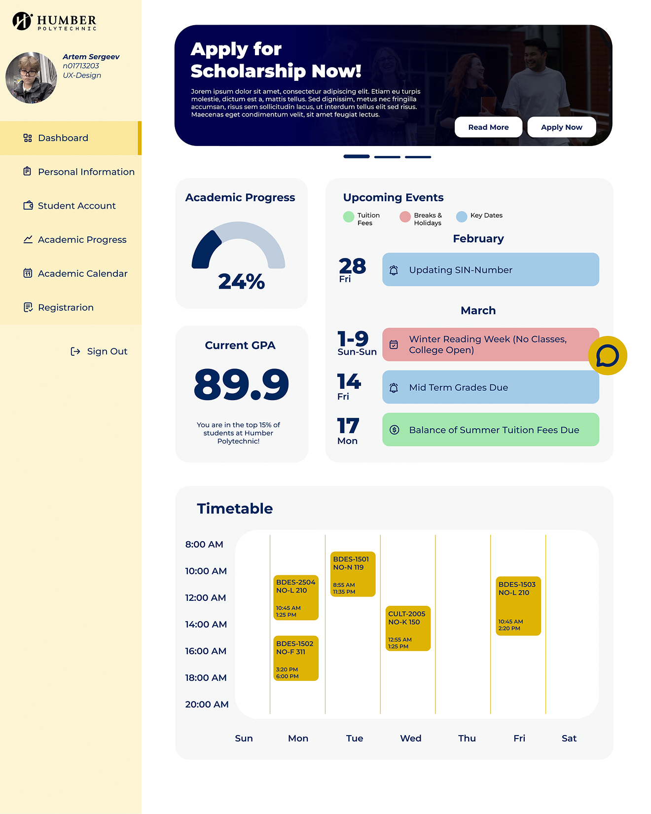
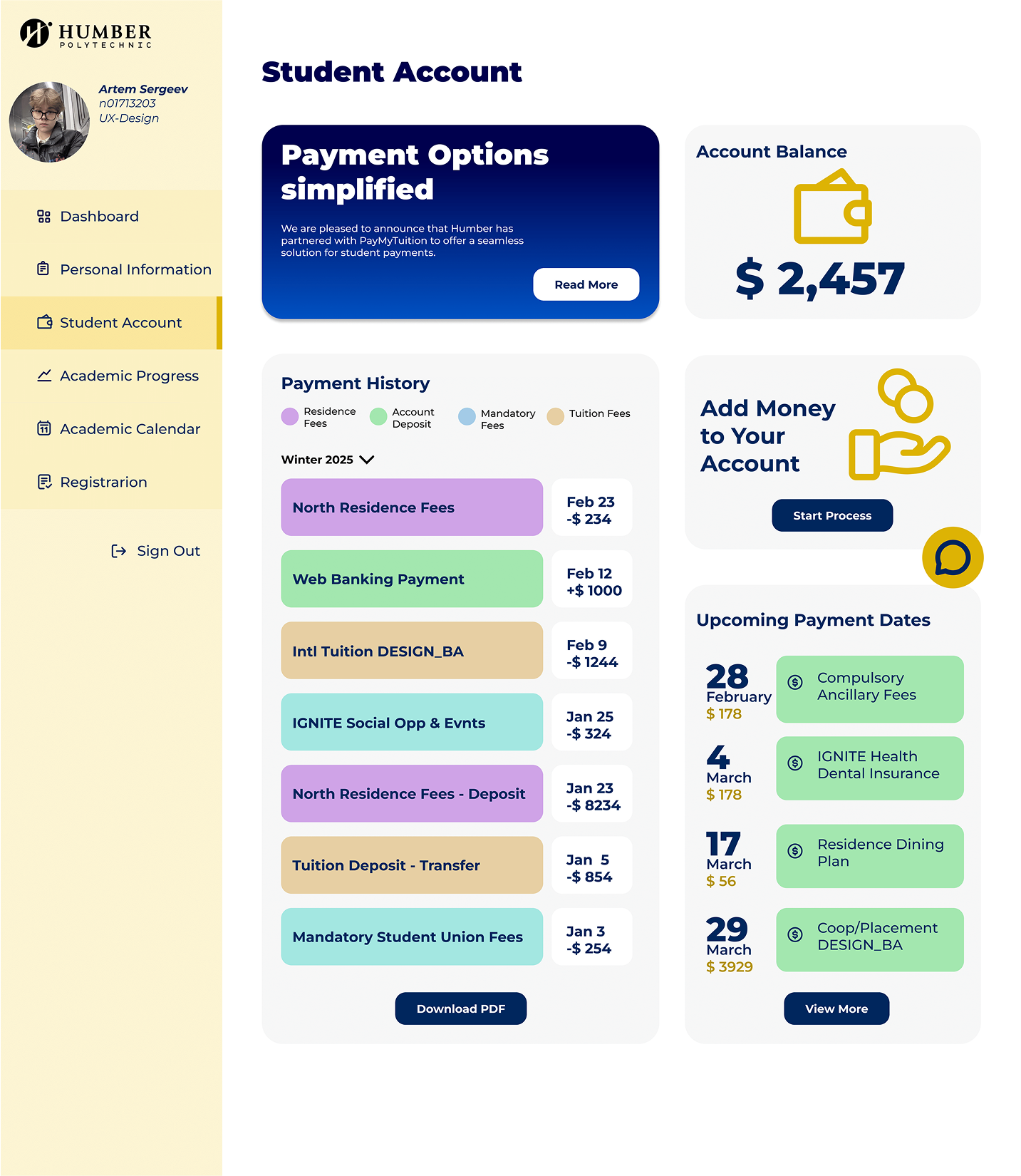
We chose a block design using Humber's signature colors: yellow and blue. Each team member provided their mockups/wireframes to the client. Our design is striking, eye-catching and memorable as we utilized UX and visual design best practices.